Why rough-looking publications require careful design
Hand lettering, crowded pages and raw marks deserve close reading alongside reference structure, production choices and accessible formats.
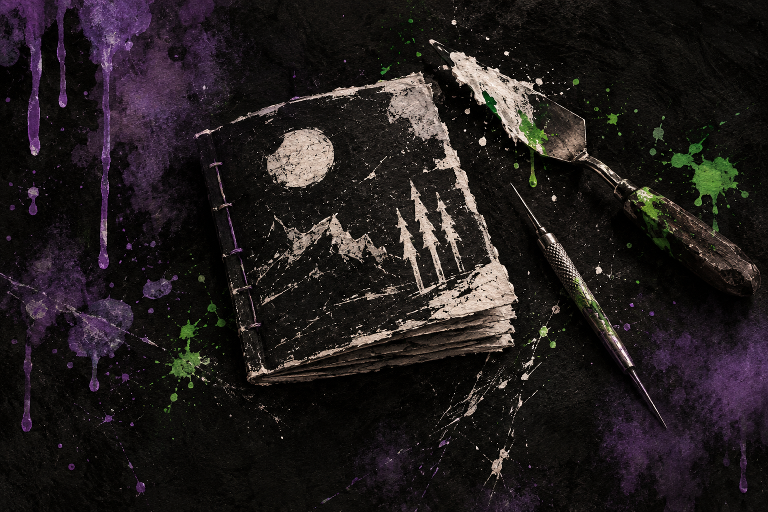
James V. West describes Black Pudding as raw, full of drawings and often lettered by hand. Then he makes a point that deserves to travel with the description: he works hard on those pages. The notebook appearance is a chosen form, and calling it rough does not tell us how much judgment went into making it. West on Black Pudding
That distinction matters when a library acquires visually forceful small-press work. Irregular lines can be deliberate. An unusual page can support a particular reading experience. Neither characteristic excuses an instruction that cannot be found, but neither justifies dismissing the publication before asking what the page is doing.
This is an analysis of documented design and production choices, with recommendations for examining copies in hand. I have not treated publisher images as a physical inspection, or inferred that a visual style is accessible to every reader.
A page makes an argument about attention
A hand-lettered creature name can make an entry feel like part of a personal notebook. The size and placement of that name can also tell a reader where the entry begins. These functions coexist. One concerns expression, the other navigation, and a good examination of the page needs to notice both.
McKenzie’s discussion of bibliography gives material form an expressive role. Typography and the arrangement of space participate in meaning, while a fuller account follows the people and institutions involved in producing and transmitting texts. That combination is especially useful for RPG zines, where a page may serve as illustration, instruction and reference during the same encounter. The opening lecture in Bibliography and the Sociology of Texts
The implication is practical. When reviewing a visually dense publication, identify the task before judging the density. A reader browsing for an idea may enjoy a page that rewards wandering, while a referee returning to a rule needs a dependable way to locate it among the illustrations, tables and surrounding instructions. The same spread can serve those readers differently, and a review should explain the difference rather than assigning a single vague verdict such as usable or chaotic.
I would give a librarian evaluating a copy two passes. First, follow the publication at its own pace and note how image, lettering and space establish relationships. Then attempt a few ordinary reference tasks. Locate an entry again after closing the book, find the continuation of a rule, and identify what a symbol means. Record the actual obstacle if one appears.
This approach allows praise to become specific as well. An illustration might distinguish a creature immediately, a repeated heading might make a busy layout easy to scan, or a page turn might separate information meant for players from information meant for a referee. Those are observable design choices. Calling a book beautiful does not explain them.
An unruly appearance can require elaborate production
KNOCK! Issue Four provides a useful complication to the idea that a zine aesthetic necessarily means minimal manufacture. Its distributor describes a 212-page, full-color A5 publication with a dust jacket and bookmark that themselves carry game material. The listing identifies writers and artists separately. Those specifications establish a deliberately assembled physical publication; they do not establish how every reader experiences it. The issue’s production description
For collection work, an extra object that carries rules belongs in the description of the contents. If a jacket or bookmark is discarded as ordinary packaging, some playable material may disappear with it. The relevant question is what the part contains, rather than whether the part resembles something a library normally removes during processing.
This is a small but consequential point about professional habits. A processing routine developed for ordinary jackets may be appropriate for many books and wrong for this copy. Staff need enough information at intake to recognize the exception. A note in an acquisition record can prevent a later colleague from having to rediscover the design through an incomplete object.
Academic teaching can use such examples to make material analysis concrete. Students can compare the information supplied by a sales listing, a digital file and a complete physical copy, where those are available. Each source permits different claims. The exercise becomes stronger when students identify those limits themselves and explain why a missing component matters to their particular question.
Reading access begins with a person and a task
Jacob Wood’s September 2026 account of rebuilding the Accessible Games website brings another kind of design labor into view. He explains that his assistive-technology use changed from screen magnification to a screen reader, while the site’s maintenance became increasingly difficult. His account concerns his own authoring environment and circumstances. It is firsthand evidence of changing access needs, not a verdict on every site or publication using the same software. Wood’s account of the redesign
That experience is a reason to ask precise questions when selecting an RPG zine. What reading versions are supplied? Can the text be selected, enlarged and followed in a sensible order? Are instructions embedded only inside an image? Answers require examination of the actual files and, where appropriate, use with the relevant assistive technology. A clean-looking page can fail those tests just as an exuberant one can.
For a library commissioning a workshop handout, I would agree on readable instructions and an appropriate digital version at the beginning, while leaving room for the artist’s visual language. Retrofitting access after a complex page has been completed can require a second round of editorial work. Planning the versions together makes that labor visible in the brief and budget.
The point is to describe quality in terms that respect both the work and its readers. A scratch, a crowded margin or a hand-drawn heading may be doing something exact. Follow its function, test the reading task, and keep the complete publication together. Roughness then becomes a feature to understand rather than a shortcut for judging the care behind the page.