Isotype Had a Knowledge Engineer Called the Transformer
Marie Reidemeister's work turning facts into visual explanations shows how design requires decisions about meaning, comparison, and audience.
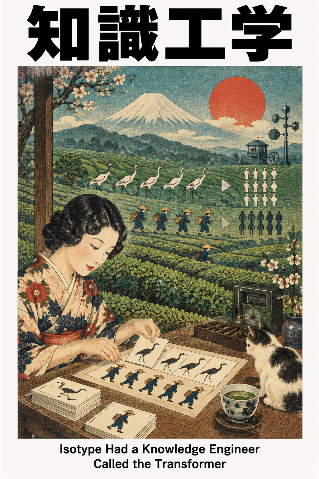
The information designer receives a set of figures about housing, work, or health. If they merely place the numbers beside attractive icons, the public still has to decide what to compare and why the comparison matters. If they choose the comparison, simplify the figures, and arrange the image so a reader can follow the argument, they have made decisions about knowledge.
In 1920s Vienna, Otto Neurath and his collaborators developed the Vienna Method of Pictorial Statistics, later called Isotype. The project sought to make social and economic facts intelligible to broad audiences through a systematic visual language. It was educational work in a specific political and civic setting, not just the invention of familiar pictograms. (University of Vienna, Isotype project history)
What the Transformer transformed
Marie Reidemeister, later Marie Neurath, held the role of Transformer. The University of Vienna’s Isotype research project describes her as translating numbers and facts into visual form and calls the role a prototype of the modern graphic designer. That title is unusually exact. She was not given a finished thought and asked to decorate it. She had to decide which facts mattered, what relationship should be shown, and how a viewer could understand it. (University of Vienna, Isotype project history)
The work required restraint as well as invention. A pictorial sign could stand for a fixed quantity; repeating the sign could show a greater amount. A designer had to decide the unit and what to do when the data did not fit it cleanly. They had to preserve differences that mattered while avoiding details that would make the result unreadable. Every simplification had an evidential cost.
That is the connection to knowledge engineering. A knowledge engineer selects concepts and relations so software can perform a task. The Transformer selected facts and visual relations so a person could understand a situation. Both had to inspect source material, establish a model, test it for its intended use, and revise it when a representation concealed something important.
The page could make a public argument
Graphic design was becoming more deliberate about such work. The New Typography movement of the 1920s and 1930s treated the printed page as a field in which blocks of type, photography, and image could be arranged according to the structure of the message rather than a symmetrical convention. The arrangement itself guided sequence and emphasis. (MoMA, “The New Typography”)
Hierarchy says which fact arrives first. Proximity makes a relation easy to see. Repetition can identify comparable cases. Separation can prevent a false equivalence. These visual decisions supply an additional semantic layer around the words and numbers. The designer may not change a single sentence, yet the reader’s understanding can change substantially.
That power creates an obligation. A visual explanation can educate people about a real condition, and it can also imply a pattern the source does not support. A contemporary knowledge interface faces the same choice when it gives one source a prominent place, hides an exception behind a click, or draws a bright line between two records whose relation remains uncertain.
The Isotype Transformer lets us see the designer as an intermediary between evidence and understanding. The next step is less obvious. Sometimes the visual artifact is not merely the final explanation. It is the object through which a team discovers what it thinks and what it still does not know.